
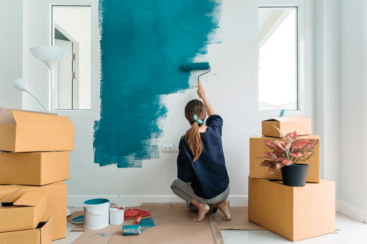
The interior paint that you choose for your home is one of the most important aspects of any remodel. The right paint can bring a room to life, set the tone for your houseguests, or make a wall stand out for everyone to admire. This article will cover all the basics of choosing colors, understanding shades and finishes, using accent walls, and getting started on the path to finding your perfect paint.
Picking a Color
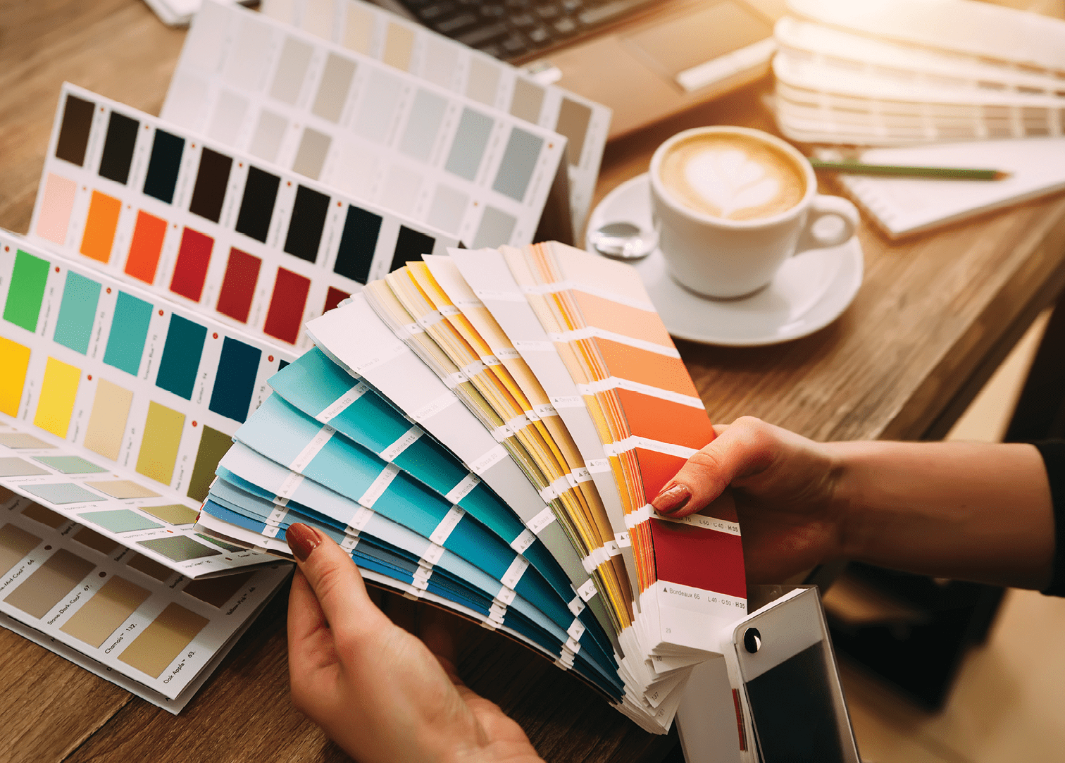
If you feel overwhelmed when choosing your paint colors from the millions of options, look around your home for colors you love. These colors can act as inspiration and allow you to narrow down your search. Do you have a room that is brought to life by a lively rug? Consider taking it with you to the store and finding a matching paint color. Maybe you have a painting in the living room that every guest compliments. Think about how an accent color from that painting would work on the walls of the room as well. If your inspiration item is too large to take with you to the store, try taking a picture of it, choosing a sampling of color swatches from the store, and comparing the swatches to the item at home.
Household goods are not the only way to choose your new paint color. Many colors are associated with the style of the home as well. If you have lots of indoor plants and darker appliances, a natural style with earthy colors of brown, green, or gray might be best. If you love the sleek, modern look of marble countertops and bright lights, consider whites, creams, or blues to best match your home.
If you do not have a favorite rug or painting, or a style for inspiration, there are professionals who can help. Local painters and home designers will know about the most popular trends in painting and the best paint for your remodeling goals. While someone else might not know your personal tastes, a professional will be able to recommend paint colors and styles to match your home and your preferences.
Creating a Feeling
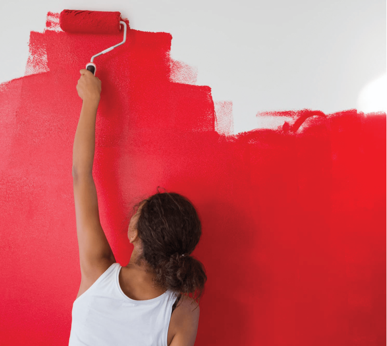
While it might be surprising, selecting the perfect paint for your home may also require some knowledge of color psychology. It has been shown that warm colors, such as red, yellow, and orange, can create a feeling of comfort and encourage activity. These warm colors might be best suited for a living room or entertainment area in your home. The shade is also important to consider though. If the red or orange is too bright, it can be overwhelming and evoke a feeling of hostility or anger. This is why muted colors like daffodil-yellow or cranberry are popular for interior painting. On the other hand, cooler colors, such as blue, green, and violet, can make you feel relaxed and calm. These colors are typically used in the bedroom, home office, or bathroom to best match the purpose of the room. Again, the shade is essential to the desired feeling of the room. A dark purple or blue can be too strong and create a feeling of sadness, which you likely want to avoid.
Accent Walls
If you are worried that your paint color might be too overwhelming for the room, consider using it for an accent wall. Having one wall in a room painted a different color than the rest can be very decorative and add an extra element to a room. Typically, home designers follow the 60-30-10 rule for using colors. Sixty percent of the room should be the dominant, or main, color. Thirty percent should be the secondary room color, including accent walls. The final ten percent should be your finishing touches from throw pillows and rugs. Color shades can also be crucial to ensuring your accent wall matches the theme of the room. Another pro tip is to paint an accent wall two shades lighter or darker than the surrounding walls. Going for a light cream accent in a room full of brown can liven up the mood. Meanwhile, a darker blue wall next to three sky blue walls can make the whole room more dramatic.
Finishes
Now that you have a good understanding of colors and shades, it is important to know what paint finish is right for you. Paint finish refers to the amount of light that the paint reflects from its surface. Some paints will reflect a lot of light and appear shiny. Other paints will absorb light and look flat. Furthermore, some paint finishes look great on walls or ceilings while others are best suited for crown molding or baseboards. Here is a brief guide to use when choosing a finish:
- Satin paint is the most popular paint finish for good reason. Satin paint is shinier than eggshell paint, although it is not as shiny as semi-gloss paint. This finish is perfect for walls in high-traffic areas like living rooms and kids’ rooms because it is scuff-resistant and stands up to regular cleaning.
- Eggshell paint is also very popular today. It is less shiny than satin but still shinier than flat paint. It is also easy to clean but not quite as resistant to scrubbing as satin. This finish is great in areas that will not require regular cleaning, such as hallways or bedrooms. It is also good at concealing wall imperfections and cracks.
- Semi-gloss paint is most commonly used on crown molding and woodwork. Much shinier than satin or eggshell paint, it can make a room seem brighter and larger. This finish can also be used to distinguish white crown molding from a white wall. It is easy to clean, although it does not conceal imperfections.
- Flat paint is another finish commonly used on ceilings. It has no shininess; however, it is the best at hiding imperfections and marks. It is also great for repainting damaged areas because there will be no visible difference between the new paint and the old. This finish is only recommended for ceilings or for walls in very low traffic areas because it can be difficult to clean.
High Quality Paints
Once you decide on your colors, shades, and finishes, you will find that there is a wide range of prices for different paint brands. While a good bargain on a gallon of paint might seem enticing, it is important to know the many benefits of using quality paint in your home. Higher quality paints allow for easier application, as they will apply evenly to your surface. This will reduce the risk of leaving roller or brush marks behind on your freshly painted wall. They will also have more pigments, meaning that fewer coats of paint are needed to cover the wall. A higher quality paint brand will also offer better resistance to fading and other damage. Cheaper paints are more likely to lose their color in the sunlight, which could be especially dangerous in a room with many windows.
Testing Paint
Painting your home can be a stressful endeavor, especially when you are using new colors. Do not forget that you can always try your paint color first by painting a paint swatch. You might also consider painting an 8” x 11” poster board to see the paint more clearly. Make sure to look at the paint color in both artificial and natural light. Once you have chosen a color, you can paint it on your wall in a 12” x 12” area as a final test. You can also try surrounding the test color with a thin white line, so your current color does not distract you. It is best to leave the paint for 48 hours so you can grow accustomed to it before you decide.
Once you have tested your paints and made your choice, just go for it. Do not be afraid to use the color you love. You will never know how great your home could look unless you try it. Make sure you plan ahead and understand proper painting techniques or hire a professional for the best outcome. It may be a complicated process, but a new, inspired paint job can make all the difference in your home! ![]()
Sam Haggerty
Home & Yard Magazine